Under the Manhattan Design System (MDS), the lack of documentation leads to inconsistent user experiences and inefficiencies in design and development. To address this, I was brought on to create a library outlining pattern usage and best practices, starting with Bottom Sheet and Navigation while exploring future opportunities.
/01 Led the design and development of the pilot pattern—Navigation—which serves as the foundation for ongoing initiatives.
/02 Led the design and development of the second pattern—Bottom Sheet, through a deep dive process involving audit, evaluation, and realignment.
/03 Served as a consultant during internal design office hours and critiques, providing guidance on leveraging patterns.


They are discrete elements of our design system that are broadly used across the entire digital ecosystem. (e.g. a dropdown)
They are constructed with components with the intend to satisfy a specific user needs. (e.g. complete a transaction)

Pattern library – Project milestone
I started by interviewing the design leads who created Chase's navigation elements to understand their approach and challenges. I then collected examples of navigation implementations across platforms in Figma and used these to design documentation pages. These pages, created in Figma for stakeholder review, will be published on the Manhattan Design System website to help designers self-serve their navigation design needs.

At a high level, I structured the navigation pages into five clear tabs—Overview, Specifications, Guidelines, Implementation, and Accessibility—to break the longer content into smaller, digestible chunks. This helped our MDS users (designers, developers, product managers, etc.) better understand the pattern.

On both the Web and Mobile navigation pages, the elements that make up the navigation are illustrated in an anatomy view using atomic design nomenclature. This view shows the design tokens (such as color, text style, and border radius) that compose each component and, ultimately, the navigation features. MDS users can utilize this page to self-serve their designs.

Chase Audit & Evaluation
Audit of the current patterns within the Chase App & Web, summarizing observations and their associated impacts on our design community and user experiences.
Competitive analysis
Conducted a competitive analysis of 14 finance apps. Created a pattern map using quantitative data and analyzed nuances in competitors' overall design choices.
Use case realignment
Redefined the pattern and realigned existing use cases with the internal messaging framework and newly discovered trends. Created a pattern matrix with provided guidelines.
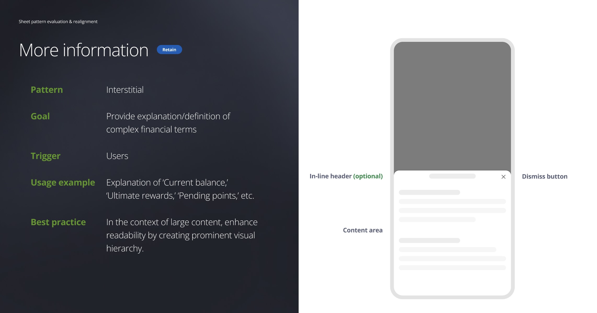
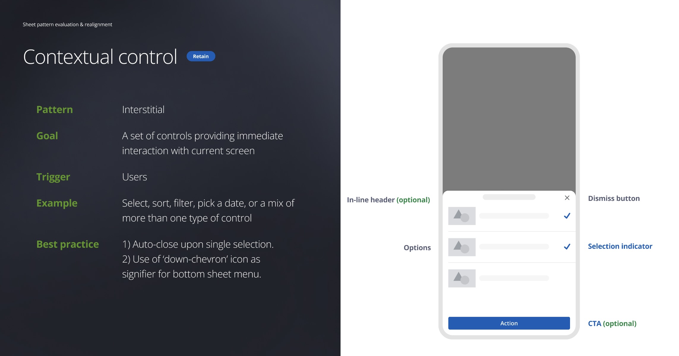
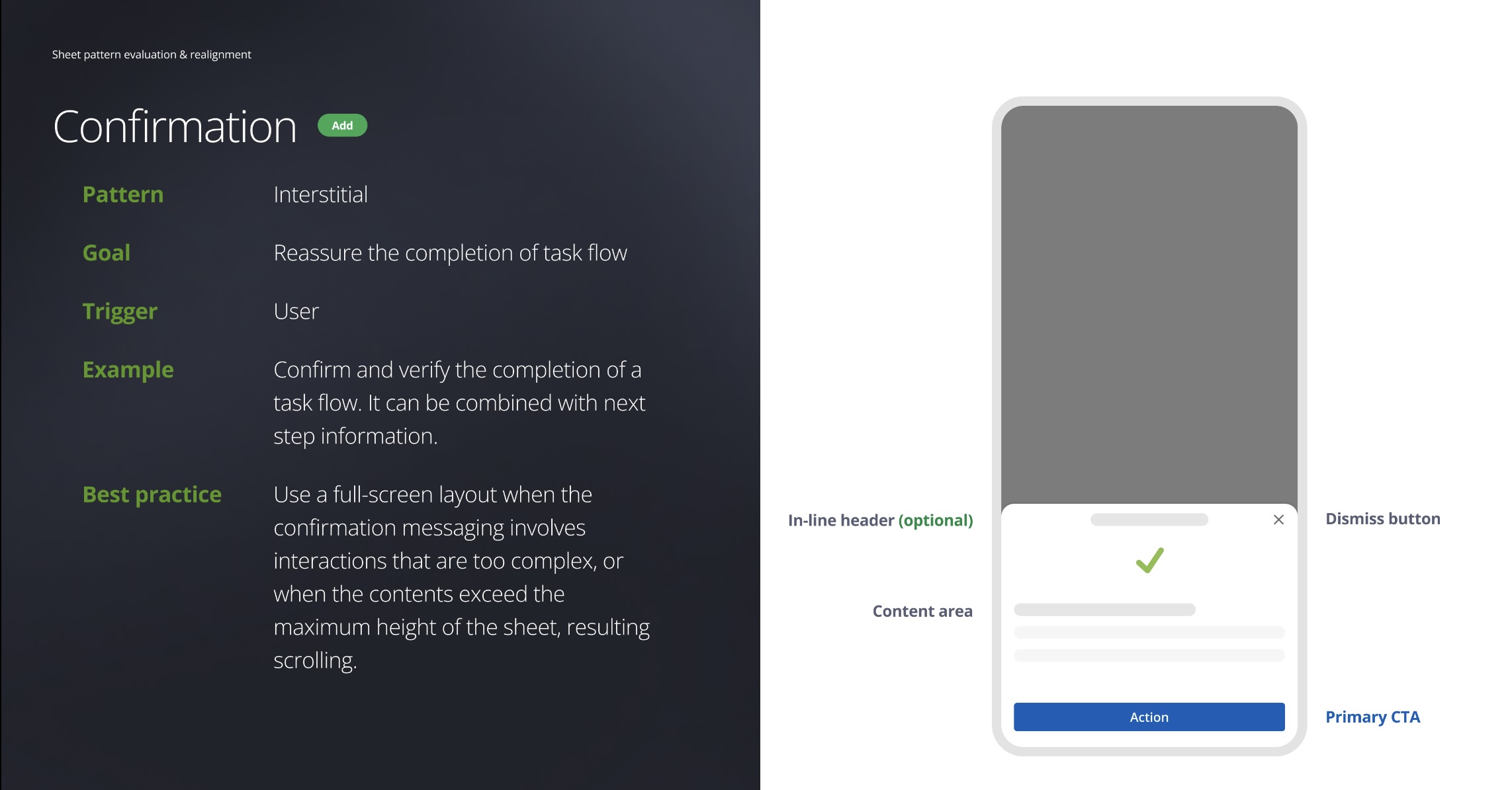
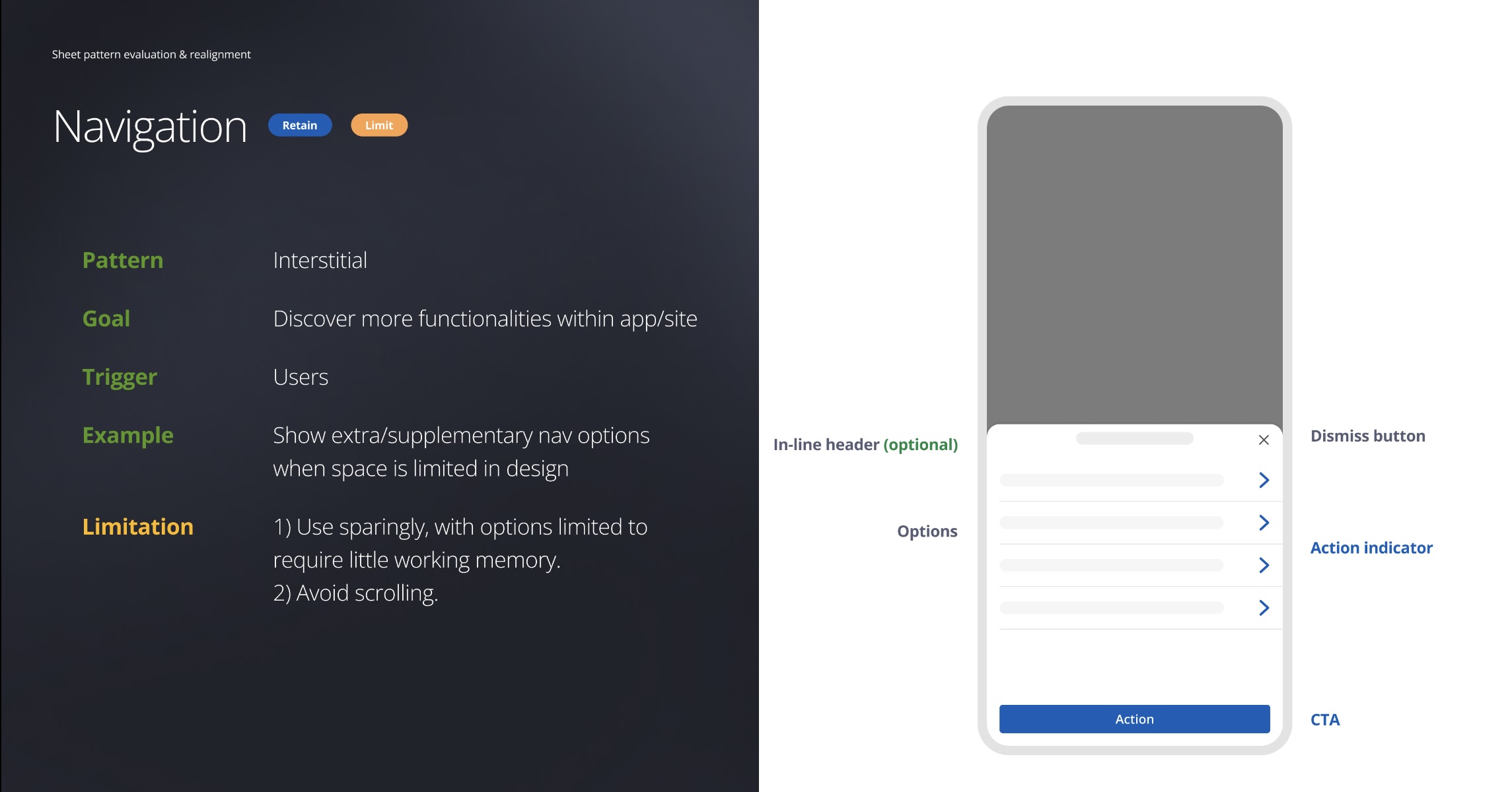
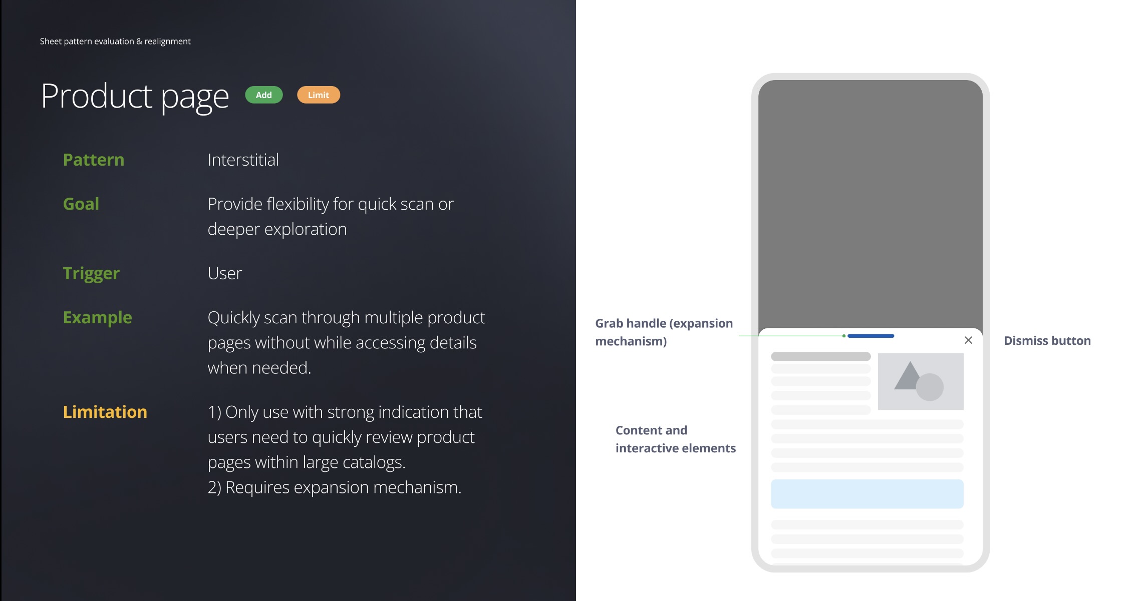
I analyzed over 60 instances of the Bottom Sheet in the Chase app, categorizing them into four use case groups. In alignment with an internal framework redefining customer messaging, the 'Deepening' use case will be decommissioned to prevent banner blindness.
Within these groups, I identified usability issues and summarized them into key trends impacting the user experience. Here are a few examples.

Varying types of information are mixed together without visual guidance to delineate them. Making it difficult for users to find information they need

Different UI elements trigger the same result inconsistently—This inconsistency makes it difficult for users to predict behavior and lacks visual cues to convey content meaning.

Navigation options are overly complex, with menus embedded in expandable UI elements. Users may struggle to reorient themselves within a bottom sheet menu, as they must recall the navigation path triggered by it.

With the hypothesis that by conducting competitive analysis of companies beyond traditional banking, we will gain a fresh perspective by not only validating current use cases but also gather inspirations as we embrace new features or product improvements.
Quantitative
Researched 14 apps to understand the prevalence of different patterns. It helps identify patterns that users are already familiar with, increase the likelihood of acceptance for our own designs.

Qualitative
Explored nuances implemented for each new discovered trend. Examined design choices and the overall user experience. The findings are summarized into an appendix.

Use case pattern map – Expanding the versatility of design capabilities.
The overall findings are summarized into 9 groups of trends, including the ones existed in Chase experience. The filled bubbles are our existing use cases, and the unfilled ones are new trends. The map gives us a view of how common a pattern is among competitors.

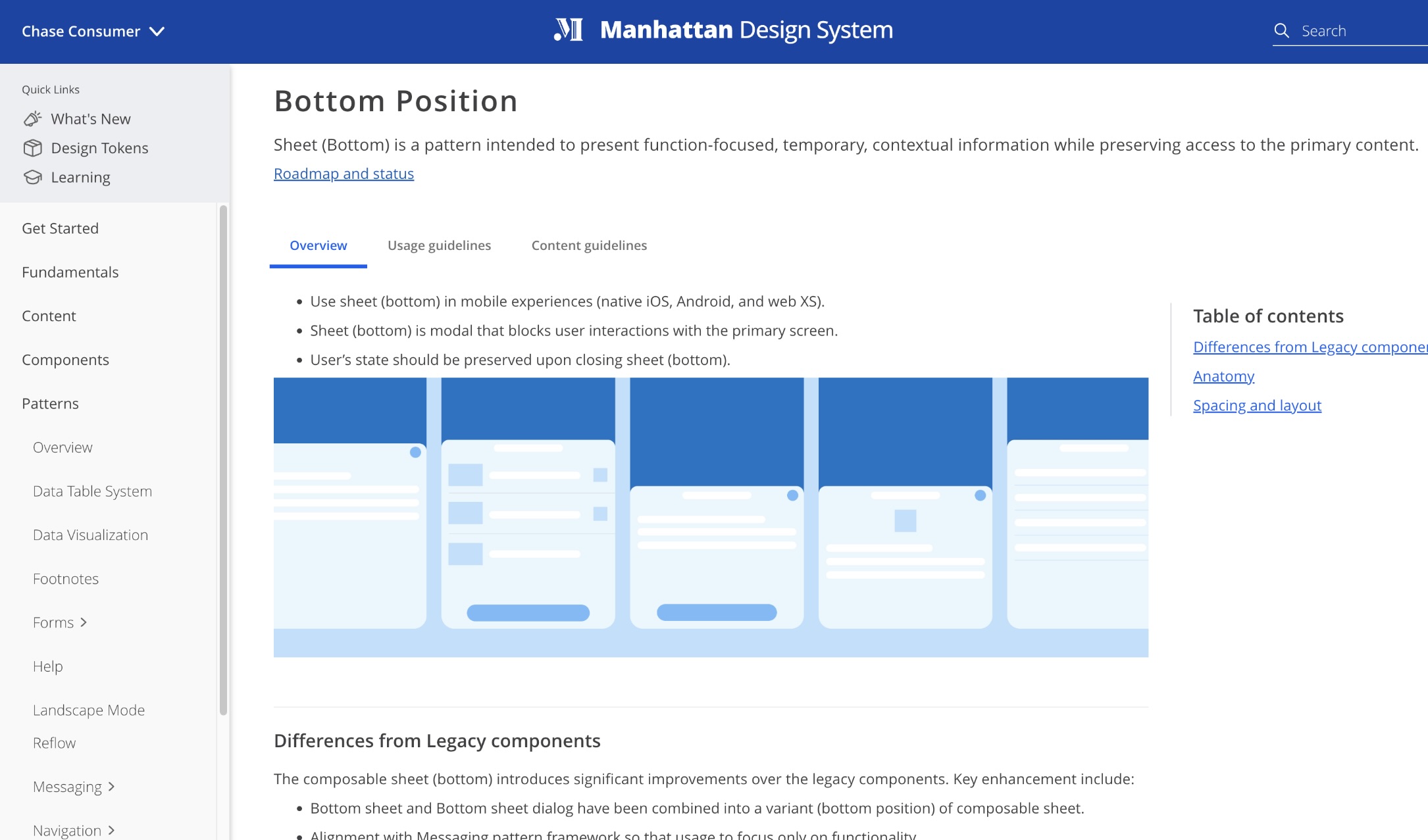
Redefine – bottom sheet is a mobile pattern intended to present function focused, temporary, contextual information while preserving access to primary point.
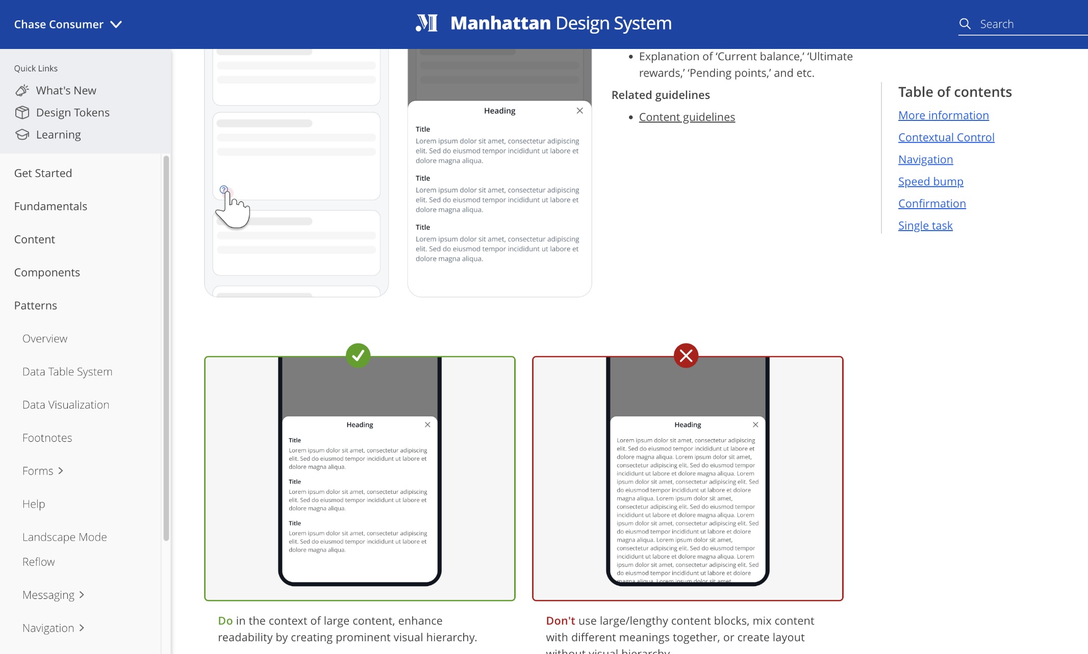
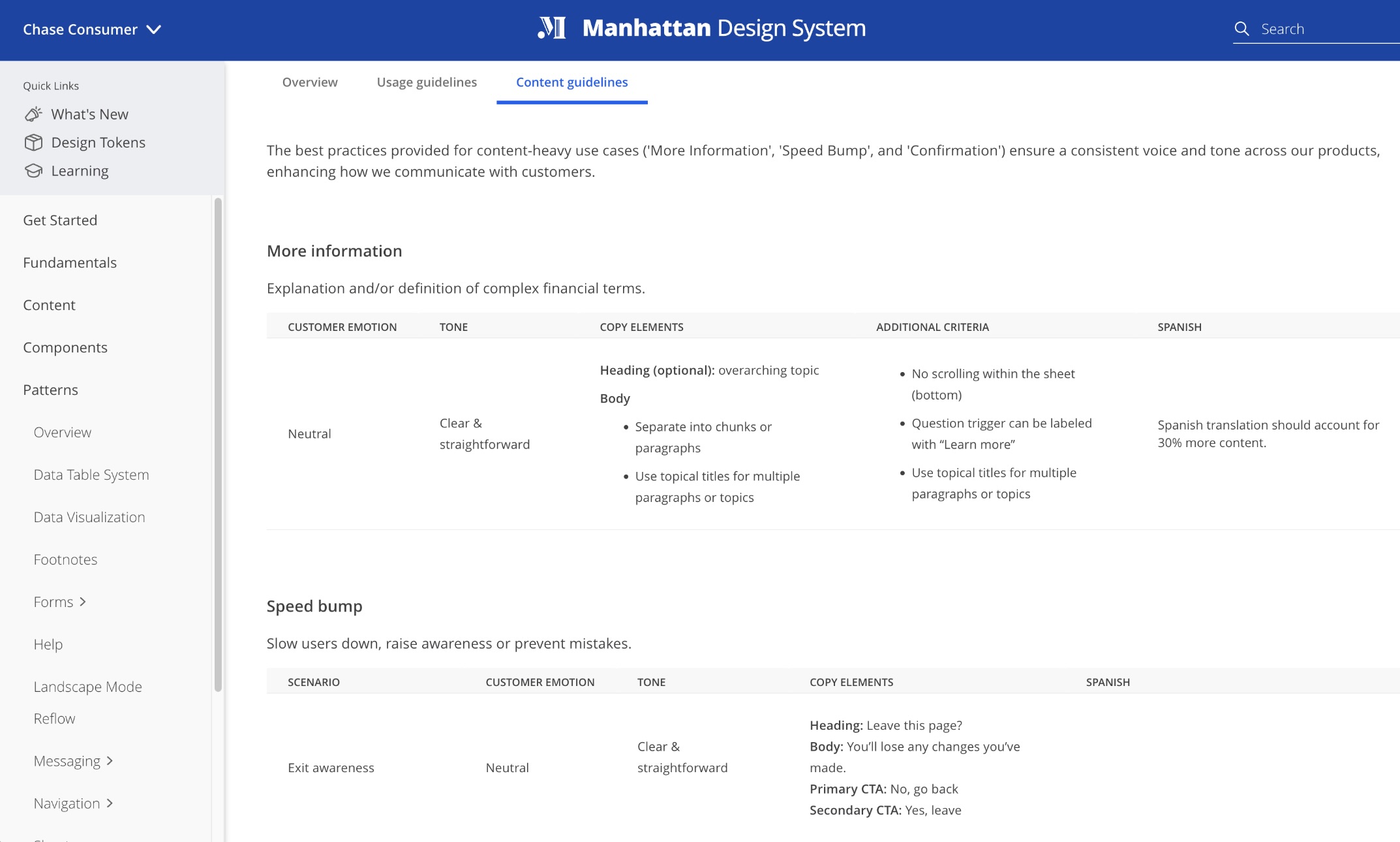
The specifications include a set of pattern illustrations along with best practice guidelines (covering when, where, and how each use case can be utilized) to help designers better understand the usage expectations.
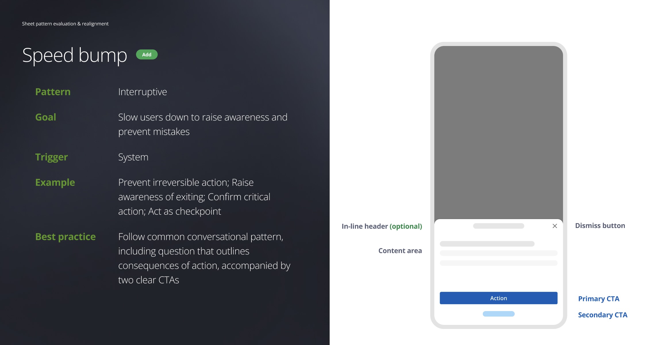
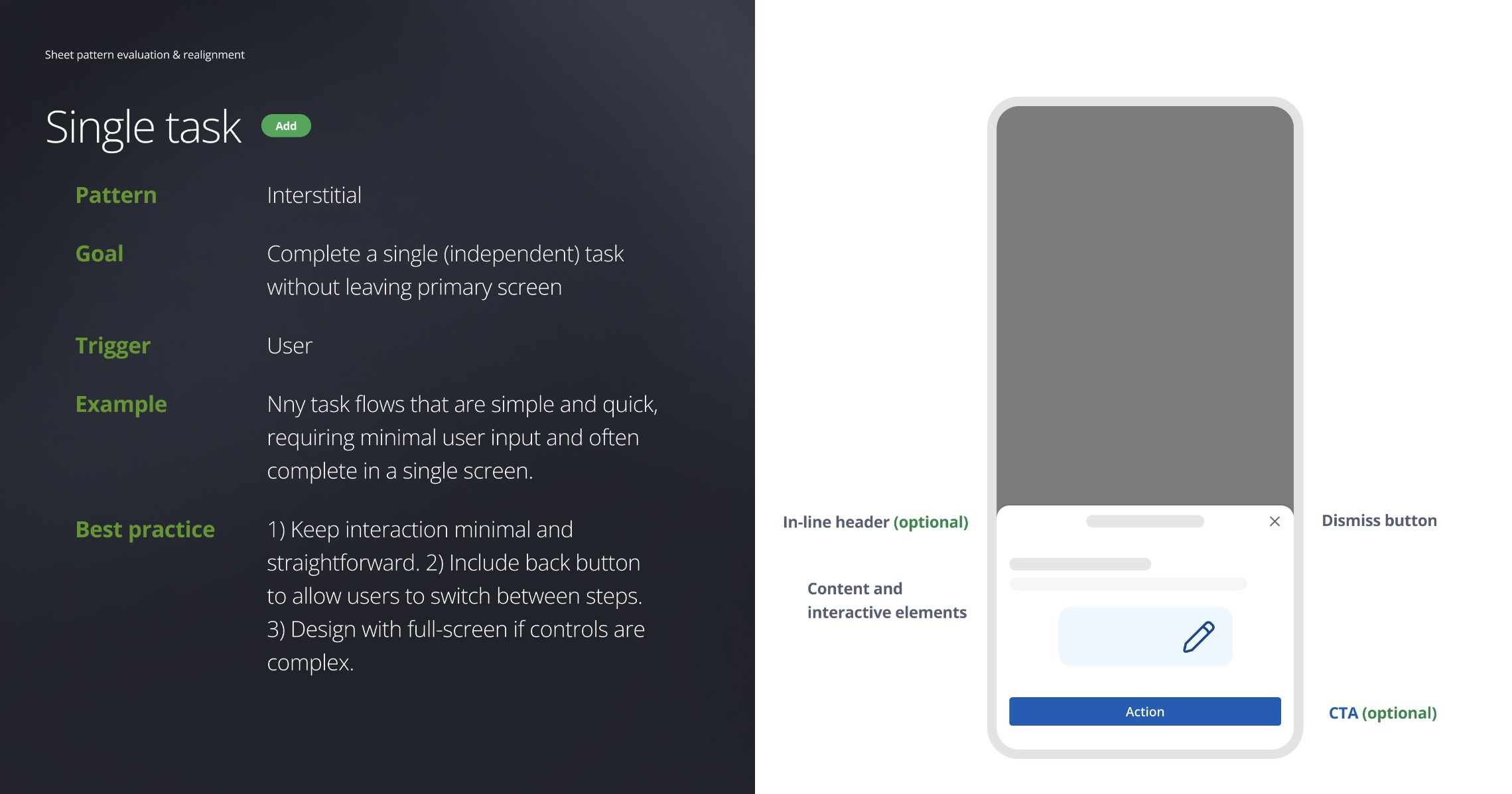
Living in MDS’s pattern section, the Sheet (bottom position) page serves as a self-help guide for Chase DCE designers.